There may come time when the business will need a custom richtext plugin, that no OOTB functionalities cover. In such case, you will have to provide the new solution as a custom client library, which plugs into the existing Coral UI interface seamlessly.
In this tutorial we will aim to achieve a functionality that covers:
- new custom button on the rich text buttons bar
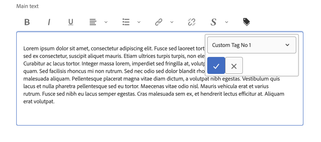
- mini dialog that opens up, once the user clicks the button
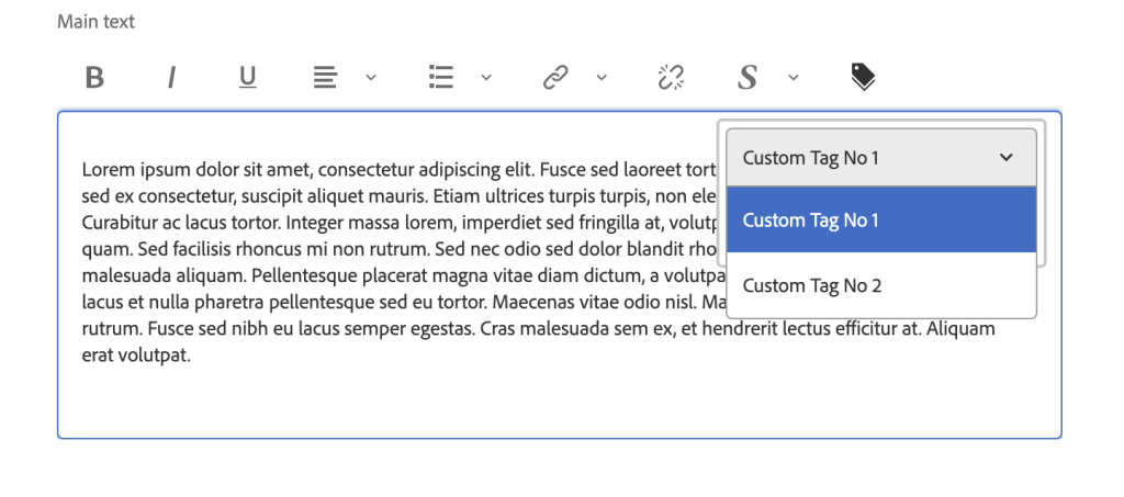
- select field that gives user the ability to choose from available tags
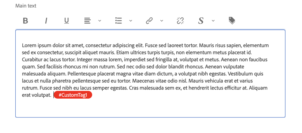
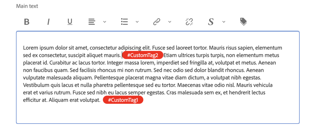
- finally, the tag will be displayed inside richtext contents with a special styling, so that it is easier distinguishable from other text.
Creating client library
We will start off with creating our own new custom clientlibrary. To do so, let’s create a folder with the main name of our client library. Good practice is to keep clientlib- on the beginning, so it’s not mixed up with other files and clearly known that it is a client library.
For this one, we will go with clientlib-rte-plugins.
Inside create 2 folders: js and less. Create also 2 .txt files: js.txt and css.txt. Lastly, add .content.xml file which stores xml configuration for the library. You should have the following structure ready:
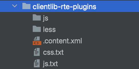
Inside the .content.xml paste the following code:
Now, the crucial part that will trigger the library in the right place is the category property, set it to ‘rte.coralui3’. This will make sure that it fires whenever we are using Coral UI 3, which is responsible for handling the richtext dialogs.
Let’s create now the files that we will be mostly working on. Start with empty tagCommand.js, tagDialog.js and tagPlugin.js under js folder, additionaly let’s include tagConfig.js for storing repeatable elements. Create also tagStyling.less inside the less folder. It should look like this:
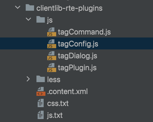
We need to also make sure those files will trigger when client library is initiated. For this purpose the txt files come in handy, they store the path and order of attaching the files.
Let’s add the following code inside the js.txt file:
And similar for css.txt:
To test if the client library fires appropriately, add dummy console logs into the first js file, build the project (or use the repo tool for faster workflow), and open any dialog inside your AEM application. You should find the console log inside terminal, once you open any kind of component dialog that you already have.
Understanding the concept of Command, Plugin and UI (Dialog)
We want to integrate with already existing dialogs, therefore it is quite necessary to understand the OOTB code that handles the dialogs. When inspecting already existing OOTB code inside CRX, you can see that the logic of functionalities related to RTE is mainly divided into 3 files: command, plugin and UI (or dialog in some cases).
The Concept
When configuring AEM RTE you can set various ‚commands’ that will be available to the author in the toolbar. Usually, this is configured inside xml for the given component under the node cq:editConfig.xml. There you can edit the available options for the RTE. The node uiSettings > cui > inline stores this information in the toolbar property:
Let’s take a look at the already existing ‘links’ functionality. In the toolbar property we see ‘links#modifylink’ – links is the main command ‘area’ let’s say, while the crucial part is beginning with # and matches exactly the command that is stored in the javascript object responsible for handling the OOTB functionality:

Therefore, each functionality can have different commands that are used to fire separate actions under one main functionality.
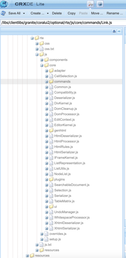
You can find the OOTB code for links under the below path in your local CRXde console:
/libs/clientlibs/granite/coralui2/optional/rte/js/core/commands/Link.js
Edit Config setup
We will start off with defining our custom command name in the edit config file:
Notice that we’ve added customtags#addcustomtag command, as well as customtags node under rteplguins.
The Config
Let’s create the config that will facilitate our further work. We will store here the repeatable elements from the whole client library, such as the command name we’ve just created for example:
The Command
Moving on to the command file itself, let’s put the below code:
Now, important part about the Command code is the ‘isCommand’ method. Although, it seems it’s not being triggered in our clientlibrary and Command file, it is crucial method fired externally by the Coral library, which handles proper command execution. This method is fired for each registered CUI.rte.command.Command, and comes with a function property of the actually fired command name as a string (defined earlier in xml). We’ve just added this method in our Command file above.
If you would like to implement also removing the custom tag, this is the place to modify your if/else statement.
The Dialog
Let’s move on to next file – tagDialog.js. I’ve also prepared the code that is ready for use:
In a nutshell, this file handles the dialog part that will be visible to the user. Here, you will define the fields and buttons that the pop up will contain.
Similarly to the Command file, Dialog file also contains crucial method responsible for triggering the construction of the dialog, namely the construct method. This method is also fired externally and expects a document fragment. Apart from constructing the dialog, It also registers the dialog with RTE Editor.
There are also certain fixed elements to make the dialog work, for example getDataType has to return a string with the node name that’s not repeated in another functionality class, otherwise the functionalities may actually mix up and the results can be unexpected. For this tutorial we are using ‘span’ tag name.
Now, the last and biggest part is the buildDialog method with the config code for dialog elements. One thing that is quite specific to the dialogs in pop overs (the Coral name for small pop ups above toolbar buttons) is that each line has to be encapsulated by a column item to make sure the styling works correctly. That’s why we needed to wrap the items config with the helper method createColumnItem.
Crucial parts about the constructing dialog is to make sure you are creating Coral UI elements that will work OOTB with the existing library. The documentation needed for each kind of available components can be found at the Coral UI library documentation:
Keep in mind, that the naming convention can be sometimes misleading, for example we want a simple input element, but the Coral naming standard for that field will be ‚TextField’ (similar to ‚popovers’, instead of usual ‚pop up’).
The Plugin
Let’s move on to the last file – the Plugin. This part contains the most of required code parts, that seem to don’t do much for us, or are not even triggered inside the other files. However, this part actually contains the most of the externally fired methods that simply have to be there in order for the whole functionality to work.
Let’s use the provided template:
The most important method that fires the plugin is the execute method. You can already see that the customTagsCommandName is the exact command name we’ve used in the Command file (in the config file and xml). This if/else statement checks for the current command name and fires the plugin accordingly, otherwise it passes on the execution to the next plugin with the relayCmd method. The biggest part that we needed to adjust is the addSpan method.
Lastly, let’s define the icon that we want to be displayed on the toolbar. You can choose from the Coral UI available icons over here:
and define it by providing icon name on line with:
tbGenerator.registerIcon(customTagsCommandNameSpace, ‘tags‘).
In this tutorial we’ve uses the ‘tag’ icon.
The styling
As the last part, we will adjust the styling of the added tag element. This is as simple as defining desired properties in the single css class:
The result
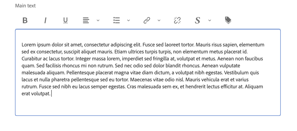
The outcome of our clientlibrary will look like below:


Leave a Reply